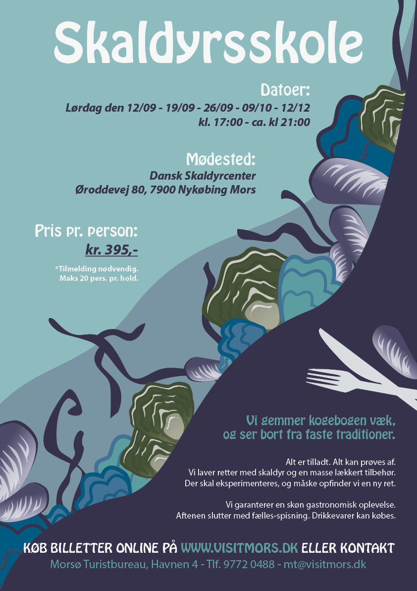
Poster advertising a cooking lesson centered around seafood.
Client: Local tourist office, 2020.
The client was looking for an illustrative, attractive way of garnering interest for the cooking class so I hand illustrated every piece of the design in Illustrator CS5 as it was the only program available.
The color scheme was kept in a blue-green ish hue to lead the customer's thoughts toward the ocean.
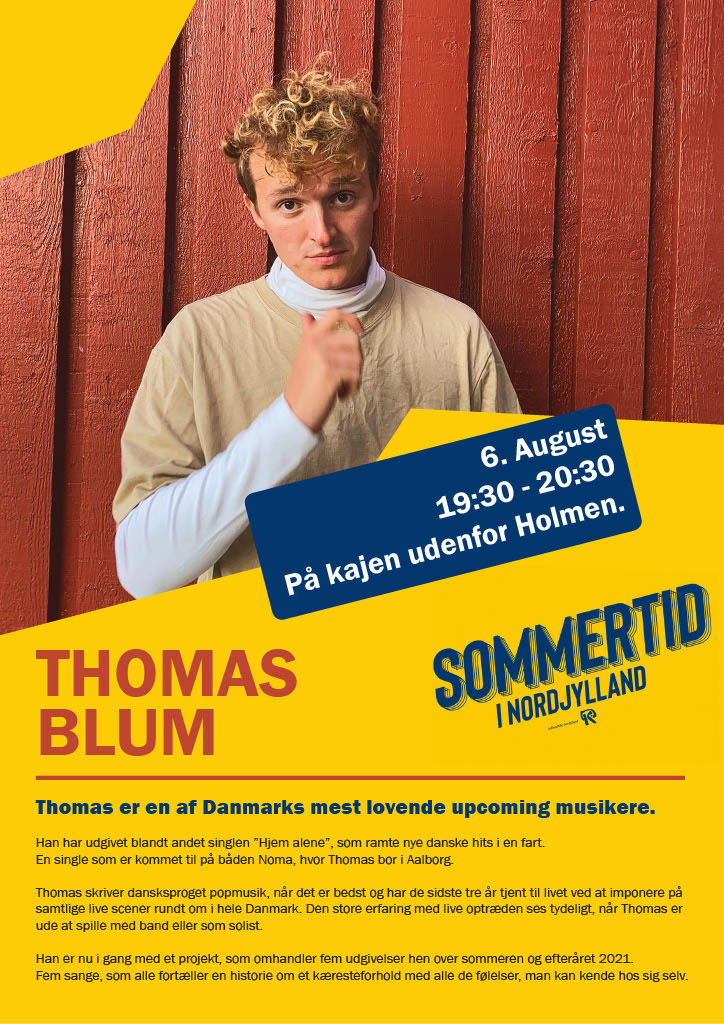
Poster advertising a musical act.
Client: local tourist office in 2021.
The client wanted a bright, eye-catching poster advertising a musical act coming to play at the harbor.
The colors of bright yellow and blue were chosen because of their contrasting nature, and also the yellow is a nice eye-catching color.
The blue makes you think of water and hopefully the harbor as well, and the red ties in with the picture of the artist himself, for a cohesive look.
The geometrical shapes help to guide the eye toward the main focus of the poster, the artist himself, and the most important information is located close to him to help the reader get the right information immediately.
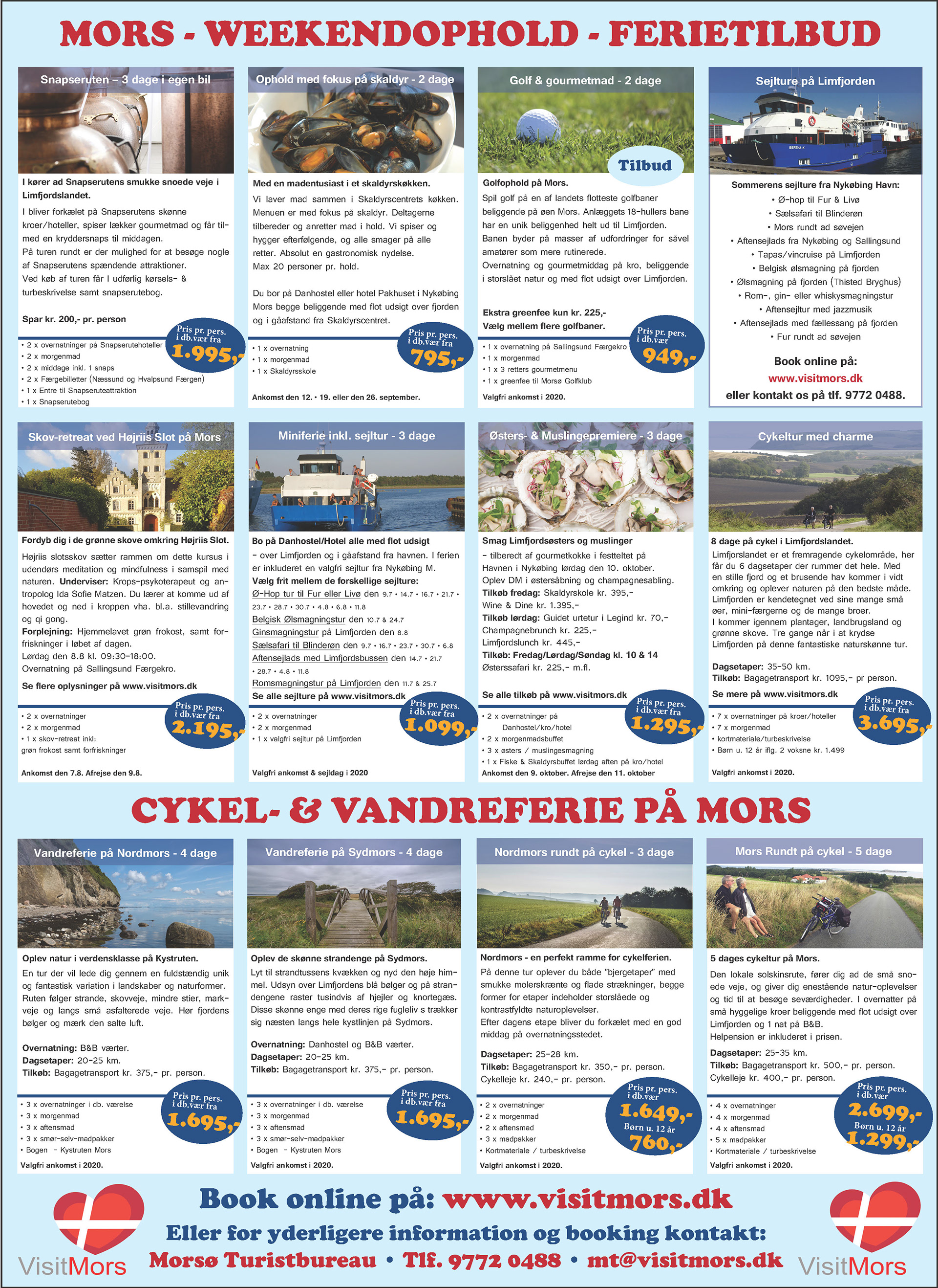
This advertisement for a holiday newspaper was another project I did for the local tourist office in 2020.
I was tasked with modernizing the entire face of the advertisement, as it had not been updated in quite a few years, and needed some tweaking.
I did not change much in terms of the background colors as per the client's request, however I did change the fonts for a more friendly look. I added the overlays on the images, to let the image behind shine through a bit more despite the information on them.
I chose the orange color for the price to let it stand out more against the blue background as "when, where, and how much" are usually some of the first questions a potential customer is asking themselves when thinking about going on a holiday.
The bold red font for the headers was chosen to make the ad more eye-catching when flipping through a newspaper.